Museum of Science & Industry
Museum of Science & Industry
Museum of Science & Industry
A concept brand identity for the Museum of Science and Industry (MSI).
A concept brand identity for the Museum of Science and Industry (MSI).
A concept brand identity for the Museum of Science and Industry (MSI).
Located south-east of downtown Chicago, MSI receives 1.5 million guests annually, hosting more than 300,000 children each year.
Located south-east of downtown Chicago, MSI receives 1.5 million guests annually, hosting more than 300,000 children each year.
Located south-east of downtown Chicago, MSI receives 1.5 million guests annually, hosting more than 300,000 children each year.
Since its establishment, MSI is an institution that aims to foster and support learning. From their exhibits to their community-focused events, MSI is a place where passion, education and experimentation are valued.
Since its establishment, MSI is an institution that aims to foster and support learning. From their exhibits to their community-focused events, MSI is a place where passion, education and experimentation are valued.
Since its establishment, MSI is an institution that aims to foster and support learning. From their exhibits to their community-focused events, MSI is a place where passion, education and experimentation are valued.
This rebrand attempts to not only identify the museum as they are, but also embody their values and structure.
This rebrand attempts to not only identify the museum as they are, but also embody their values and structure.
This rebrand attempts to not only identify the museum as they are, but also embody their values and structure.


When researching MSI, a keyword that stood out was the word, interactive.
When researching MSI, a keyword that stood out was the word, interactive.
When researching MSI, a keyword that stood out was the word, interactive.
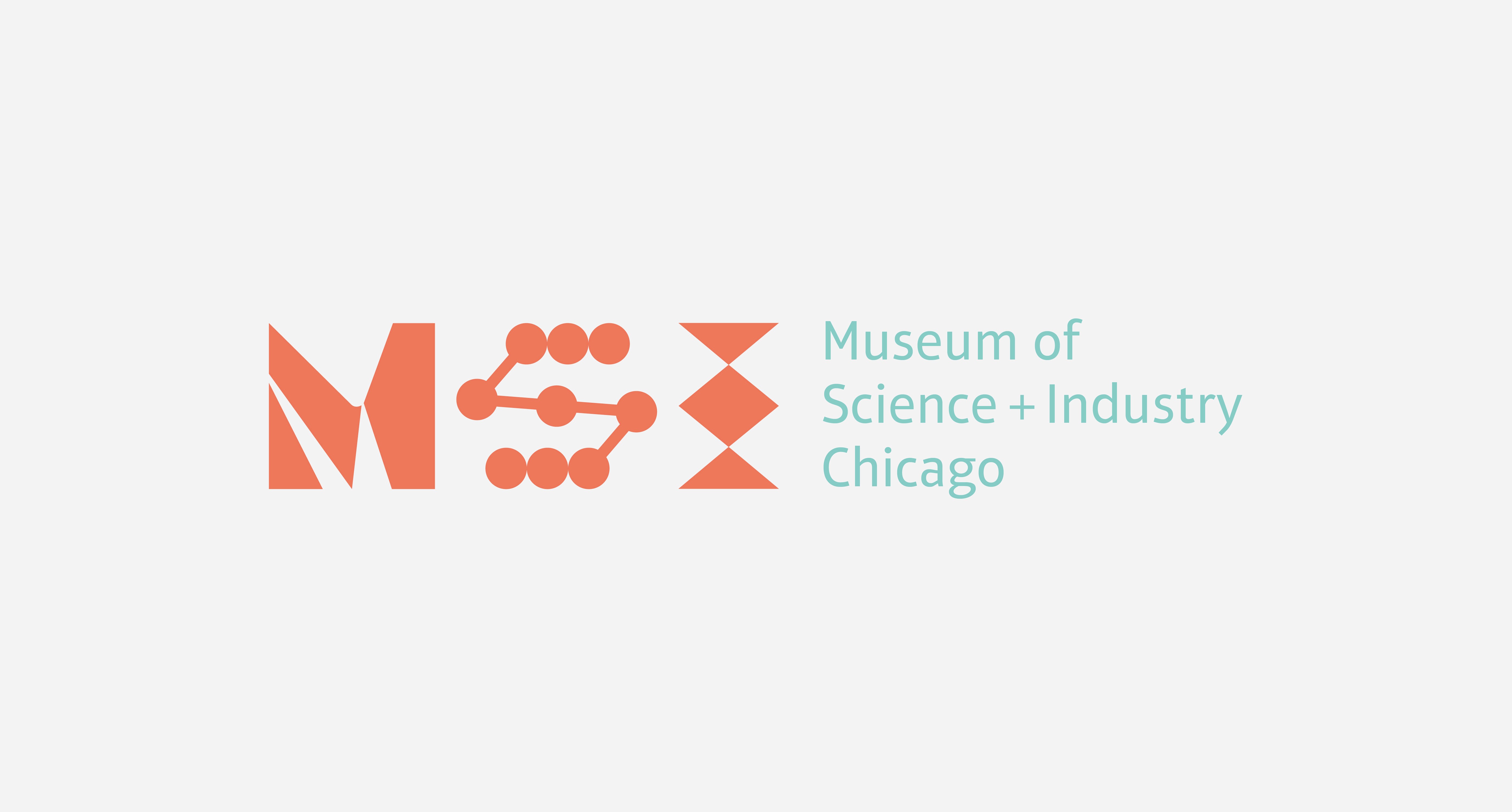
In order to reflect the idea of interactive the notion of a dynamic mark was explored. The idea was to create a system of letterforms that could be used interchangeably with one another.
In order to reflect the idea of interactive the notion of a dynamic mark was explored. The idea was to create a system of letterforms that could be used interchangeably with one another.
In order to reflect the idea of interactive the notion of a dynamic mark was explored. The idea was to create a system of letterforms that could be used interchangeably with one another.
The M in the logo remains the same, while the S and the I change. This also represents how Science + Industry is constantly evolving inside of the Museum.
The M in the logo remains the same, while the S and the I change. This also represents how Science + Industry is constantly evolving inside of the Museum.
The M in the logo remains the same, while the S and the I change. This also represents how Science + Industry is constantly evolving inside of the Museum.
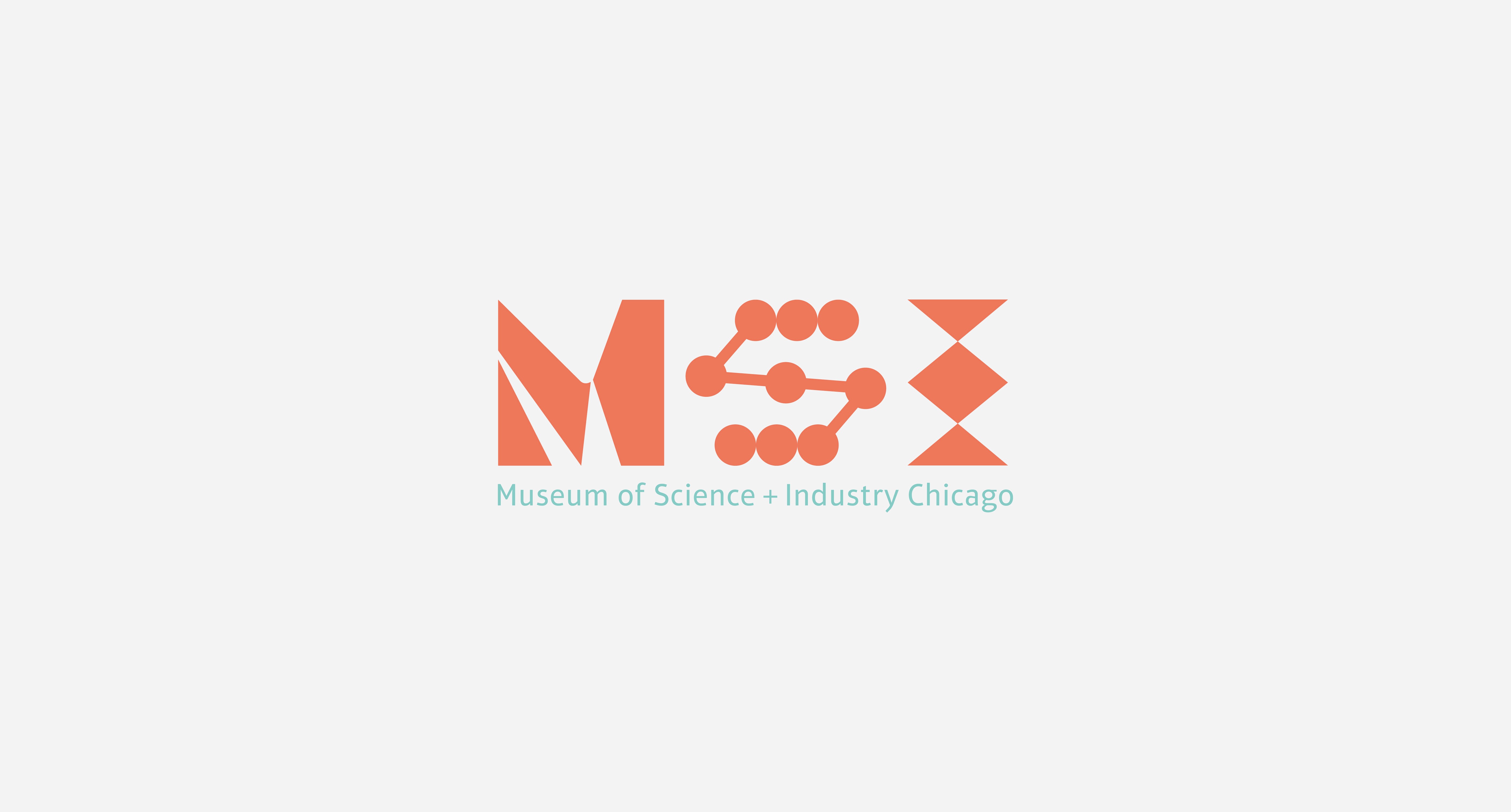


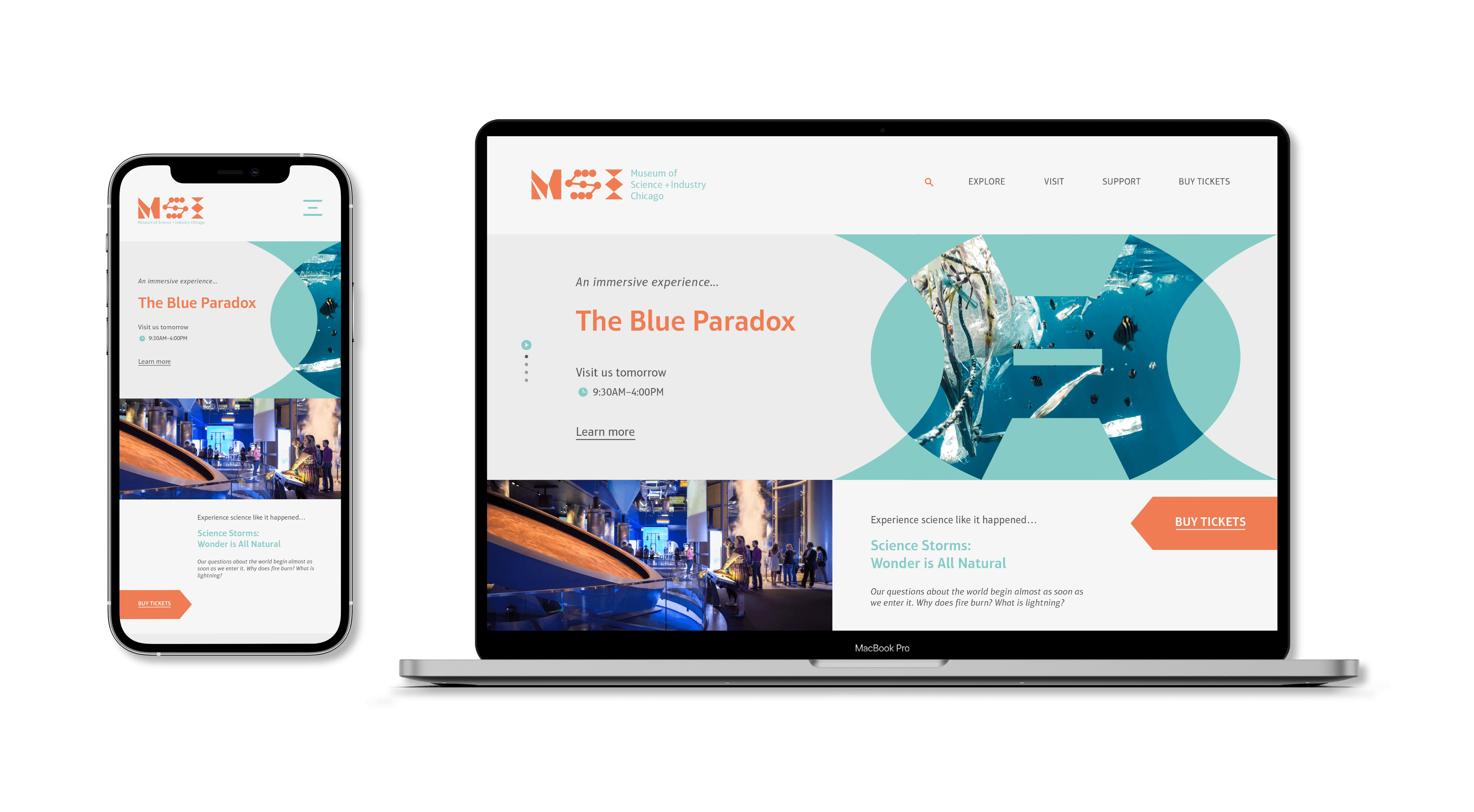
While the logo is meant to be a dynamic logo, a static version was also designed. The fixed version is used for more tangible applications, while the dynamic version will be used for digital applications.
While the logo is meant to be a dynamic logo, a static version was also designed. The fixed version is used for more tangible applications, while the dynamic version will be used for digital applications.
While the logo is meant to be a dynamic logo, a static version was also designed. The fixed version is used for more tangible applications, while the dynamic version will be used for digital applications.


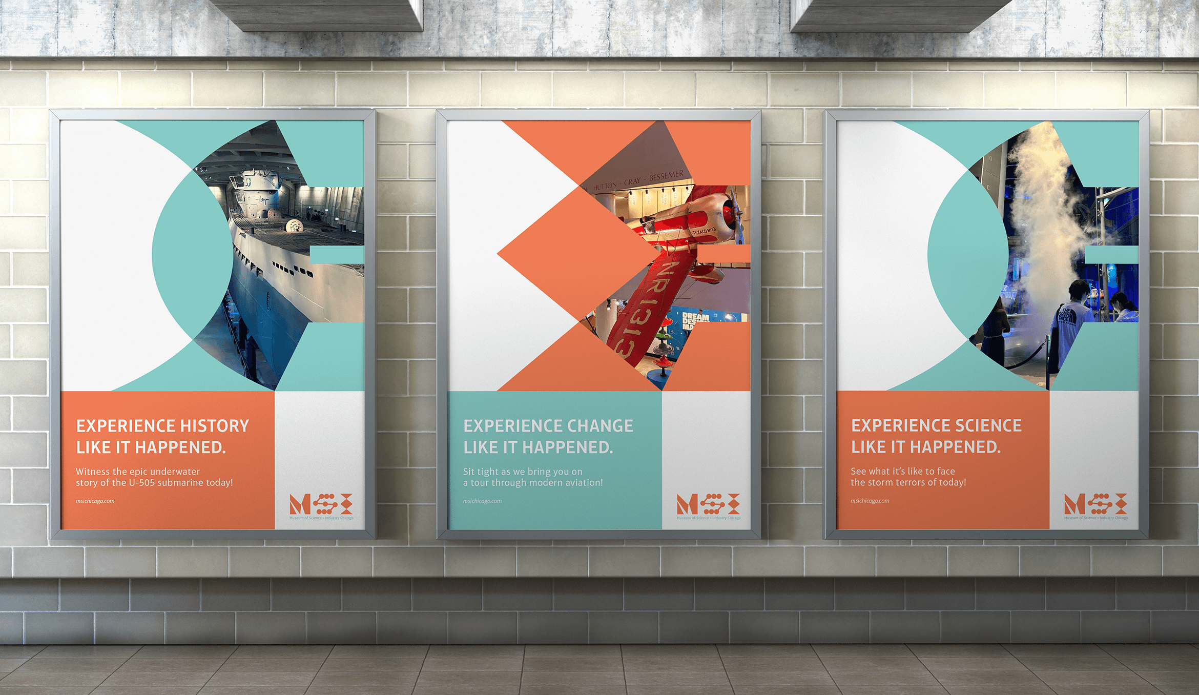
To help further establish MSI’s identity, some graphic elements were made, inspired from the existing letterforms.
To help further establish MSI’s identity, some graphic elements were made, inspired from the existing letterforms.
To help further establish MSI’s identity, some graphic elements were made, inspired from the existing letterforms.